Romantic 3D Love Box with Floating Hearts
By AI Quick Tool
05 Mar, 2025 · 14 hours ago
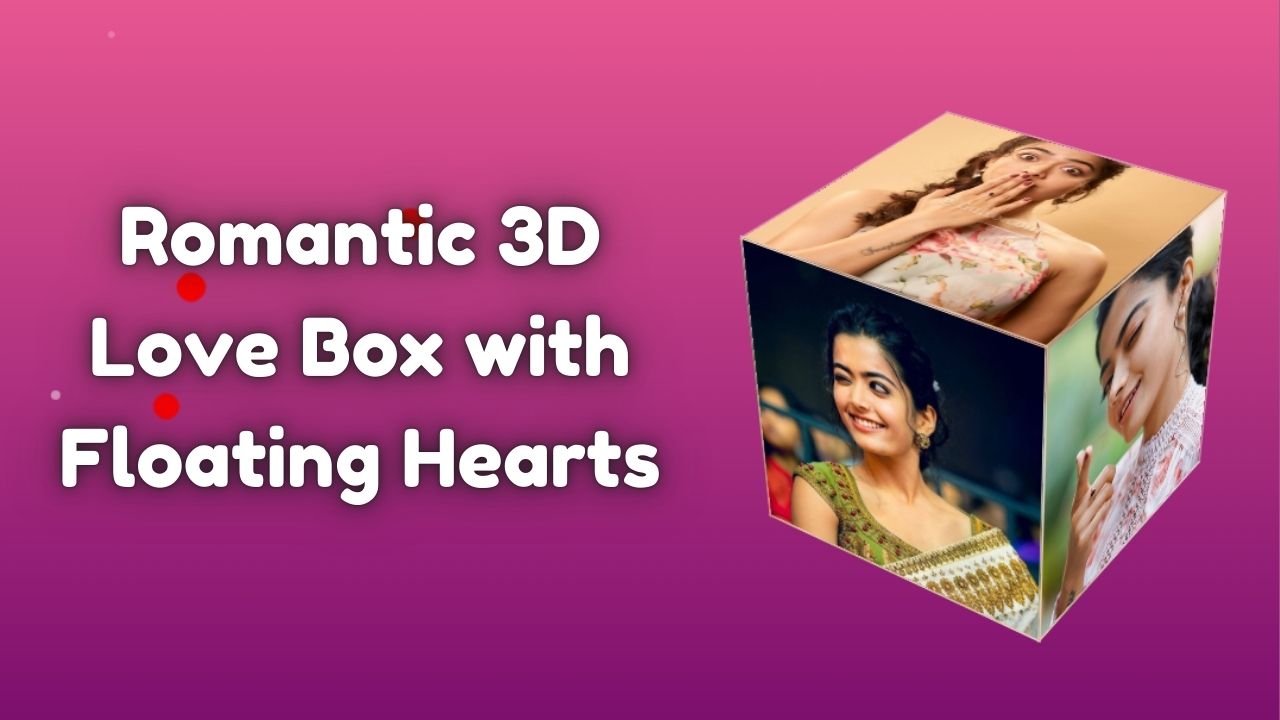
Experience a mesmerizing 3D rotating love box with floating hearts and sparkles animation. A beautifully designed romantic HTML & CSS project with interactive animations and hover effects. Perfect for Valentine’s Day, love-themed events, or creative projects!
Project Overview
This project is a visually captivating and interactive Romantic 3D Love Box webpage featuring:
- 3D Rotating Love Box with six sides displaying beautiful images.
- Scatter Animation on Hover, where the cube’s faces disperse gracefully.
- Floating Hearts & Sparkles dynamically generated for a romantic ambiance.
- Glassmorphism Design with a stylish blur and neon glow effect.
- Smooth CSS Animations, including rotation, scaling, and opacity transitions.
- Fully Responsive Layout ensuring seamless experience on both desktop and mobile.
How to Run the Project
1. Download or Copy the Code
- You can copy the provided HTML file and save it as index.html.
2. Open in a Browser
- Simply double-click the index.html file, and it will open in your default web browser.
- No additional setup is required.
Project Structure
1. HTML File (index.html)
- Contains a 3D rotating love box with six images representing romantic memories.
- Includes floating hearts animation using <div> elements dynamically generated with JavaScript.
- Uses Google Fonts for an elegant and modern typography style.
2. CSS Styling (Inline in <style>)
- Background Gradient: A dreamy and romantic twilight aesthetic.
- Glassmorphism Effect: Transparent 3D love box with a soft blur and neon glow.
- Scatter Animation: On hover, cube faces gently disperse and reassemble.
- Floating Hearts: Small hearts drift smoothly across the screen for an enchanting effect.
3. JavaScript (Inside <script>)
- Dynamically generates floating hearts with random sizes, colors, and animations.
- Implements interactive cube rotation with smooth transitions.
- Controls scatter animation, triggering face separation and realignment on hover.
Conclusion
This 3D Love Box with Scatter Animation is a stunning and interactive way to express love online. It runs seamlessly in any browser without setup and is easily customizable for Valentine’s Day, anniversaries, or romantic surprises. 💖✨
Source Code
<!DOCTYPE html>
<html lang="en">
<head>
    <meta charset="UTF-8">
    <meta name="viewport" content="width=device-width, initial-scale=1.0">
    <title>Romantic 3D Love Box with Scatter Animation</title>
    <style>
        body {
            display: flex;
            justify-content: center;
            align-items: center;
            min-height: 100vh;
            background: radial-gradient(circle, #ff6699, #660066);
            perspective: 1000px;
            overflow: hidden;
            position: relative;
        }

        /* Romantic Background */
        .background {
            position: fixed;
            top: 0;
            left: 0;
            width: 100%;
            height: 100%;
            z-index: -1;
            background: linear-gradient(to bottom, #ff6699, #660066);
        }

        .hearts {
            position: absolute;
            width: 100%;
            height: 100%;
            pointer-events: none;
        }

        .heart {
            position: absolute;
            width: 25px;
            height: 25px;
            background: red;
            clip-path: path('M12 2C7 2 2 7 2 12s5 10 10 10 10-5 10-10S17 2 12 2z');
            animation: float 6s infinite ease-in-out;
            opacity: 0.6;
            filter: drop-shadow(0 0 8px rgba(255, 0, 100, 0.7));
        }

        .sparkle {
            position: absolute;
            width: 6px;
            height: 6px;
            background: rgba(255, 255, 255, 0.8);
            border-radius: 50%;
            animation: twinkle 2s infinite ease-in-out;
        }

        @keyframes float {
            0% { transform: translateY(100vh) scale(0.5); opacity: 0; }
            50% { opacity: 1; }
            100% { transform: translateY(-20vh) scale(1.5); opacity: 0; }
        }

        @keyframes twinkle {
            0% { transform: scale(0.5); opacity: 0; }
            50% { transform: scale(1.3); opacity: 1; }
            100% { transform: scale(0.5); opacity: 0; }
        }

        /* 3D Rotating Love Box */
        .container {
            width: 220px;
            height: 220px;
            position: relative;
            transform-style: preserve-3d;
            animation: rotateBox 6s ease-in-out infinite alternate;
            transition: transform 0.5s ease-in-out;
        }

        .container:hover {
            animation-play-state: paused;
            transform: scale(1.1);
        }

        .face {
            position: absolute;
            width: 220px;
            height: 220px;
            display: flex;
            justify-content: center;
            align-items: center;
            border: 2px solid rgba(255, 255, 255, 0.3);
            background: rgba(255, 255, 255, 0.1);
            backdrop-filter: blur(12px);
            overflow: hidden;
            transition: transform 1s ease-in-out, opacity 0.5s ease-in-out;
            box-shadow: inset 0 0 10px rgba(255, 0, 100, 0.5);
            opacity: 1;
        }

        .face img {
            width: 100%;
            height: 100%;
            object-fit: cover;
            transition: transform 0.3s ease-in-out;
        }

        .face:hover img {
            transform: scale(1.1);
        }

        .front { transform: translateZ(110px); }
        .back { transform: rotateY(180deg) translateZ(110px); }
        .right { transform: rotateY(90deg) translateZ(110px); }
        .left { transform: rotateY(-90deg) translateZ(110px); }
        .top { transform: rotateX(90deg) translateZ(110px); }
        .bottom { transform: rotateX(-90deg) translateZ(110px); }

        @keyframes rotateBox {
            0% { transform: rotateX(0deg) rotateY(0deg); }
            50% { transform: rotateX(45deg) rotateY(45deg); }
            100% { transform: rotateX(360deg) rotateY(360deg); }
        }

        /* Scatter Animation on Hover */
        .container:hover .face {
            animation: scatter 2s ease-out forwards;
            opacity: 1;
        }

        @keyframes scatter {
            0% {
                opacity: 1;
                transform: translateZ(110px) rotateY(0deg) rotateX(0deg);
            }
            100% {
                opacity: 1;
                transform: translateZ(0px) rotateY(var(--scatter-y, 0deg)) rotateX(var(--scatter-x, 0deg)) translate(var(--scatter-x-offset, 0px), var(--scatter-y-offset, 0px));
            }
        }

        /* Define scatter positions for each face */
        .front {
            --scatter-y: 45deg;
            --scatter-x: 0deg;
            --scatter-x-offset: 200px;
            --scatter-y-offset: 0px;
        }

        .back {
            --scatter-y: -135deg;
            --scatter-x: 0deg;
            --scatter-x-offset: -200px;
            --scatter-y-offset: 0px;
        }

        .right {
            --scatter-y: 135deg;
            --scatter-x: 0deg;
            --scatter-x-offset: 0px;
            --scatter-y-offset: 200px;
        }

        .left {
            --scatter-y: -45deg;
            --scatter-x: 0deg;
            --scatter-x-offset: 0px;
            --scatter-y-offset: -200px;
        }

        .top {
            --scatter-y: 0deg;
            --scatter-x: 90deg;
            --scatter-x-offset: 0px;
            --scatter-y-offset: 200px;
        }

        .bottom {
            --scatter-y: 0deg;
            --scatter-x: -90deg;
            --scatter-x-offset: 0px;
            --scatter-y-offset: -200px;
        }
    </style>
</head>
<body>
    <div class="background">
        <div class="hearts"></div>
    </div>
    <div class="container">
        <div class="face front"><img src="https://igimage.indiaglitz.com/tamil/home/rashmikamandanna22112020.jpg" alt="Love Image 1"></div>
        <div class="face back"><img src="https://images.news18.com/ibnlive/uploads/2025/02/rashmika-4-2025-02-eb066427de5104fcbb0105eb0943a4c1-16x9.jpg" alt="Love Image 2"></div>
        <div class="face right"><img src="https://content.tupaki.com/twdata/2020/0920/photos/actress/Rashmika%20Mandanna%20Sensuous%20Poses/normal/Rashmika%20Mandanna%20Sensuous%20Poses_5.jpg" alt="Love Image 3"></div>
        <div class="face left"><img src="https://i.pinimg.com/736x/5c/d9/f0/5cd9f05328cd6aaf6631267e71b4a99b.jpg" alt="Love Image 4"></div>
        <div class="face top"><img src="https://i.pinimg.com/736x/30/ef/08/30ef086d71ac689af45d6cc2f8b12f8e.jpg" alt="Love Image 5"></div>
        <div class="face bottom"><img src="https://i.pinimg.com/736x/5c/d9/f0/5cd9f05328cd6aaf6631267e71b4a99b.jpg" alt="Love Image 6"></div>
    </div>

    <script>
        // Generate hearts and sparkles dynamically
        function createHeart() {
            const heart = document.createElement('div');
            heart.className = 'heart';
            heart.style.left = Math.random() * 100 + 'vw';
            heart.style.animationDuration = Math.random() * 3 + 3 + 's';
            document.querySelector('.hearts').appendChild(heart);
            setTimeout(() => heart.remove(), 6000);
        }

        function createSparkle() {
            const sparkle = document.createElement('div');
            sparkle.className = 'sparkle';
            sparkle.style.left = Math.random() * 100 + 'vw';
            sparkle.style.top = Math.random() * 100 + 'vh';
            sparkle.style.animationDuration = Math.random() * 1 + 1 + 's';
            document.querySelector('.hearts').appendChild(sparkle);
            setTimeout(() => sparkle.remove(), 2000);
        }

        setInterval(createHeart, 150);
        setInterval(createSparkle, 100);
    </script>
</body>
</html>
Related Projects
Elevate Your Brand with a Modern Landing Page Template
This modern, futuristic landing page is designed to elevate...
ViewRomantic 3D Love Box with Floating Hearts
Experience a mesmerizing 3D rotating love box with floating...
ViewNeon Glow Birthday Celebration Card
This project is a trendy and futuristic birthday celebration...
View